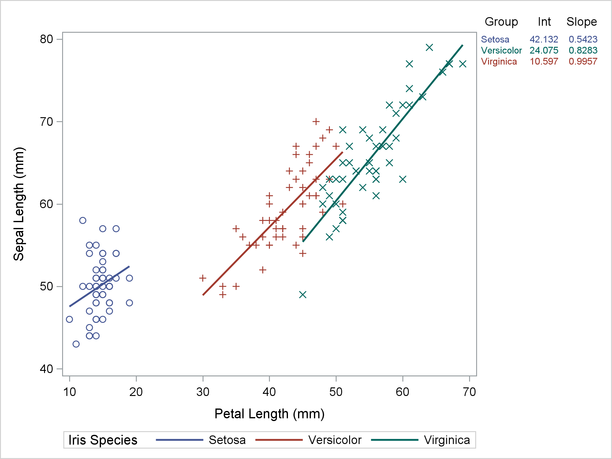
Most of the time, we run PROC SGPLOT and it does exactly what we expect. Most of the time, we can be blissfully unaware that it creates a graph template and a data object that might contain new variables. When PROC SGPLOT does not work as we expect, we might need to look at the template and data object. This post shows the steps I took to diagnose and fix some initially incorrect code that I wrote for my previous post. In my previous post, displaying a grouped regression fit plot along with the parameter estimates, I showed how to make the following graph.
Data Preparation Code
ods graphics on / attrpriority=none; options missing=' '; proc sgplot data=all dattrmap=attrmap noautolegend; styleattrs datalinepatterns=(solid); scatter y=row x=petallength / y2axis markerattrs=(size=0); reg y=sepallength x=petallength / group=species attrid=variety; yaxistable group Int Slope / y=row y2axis colorgroup=group attrid=variety; y2axis reverse display=none; run; |
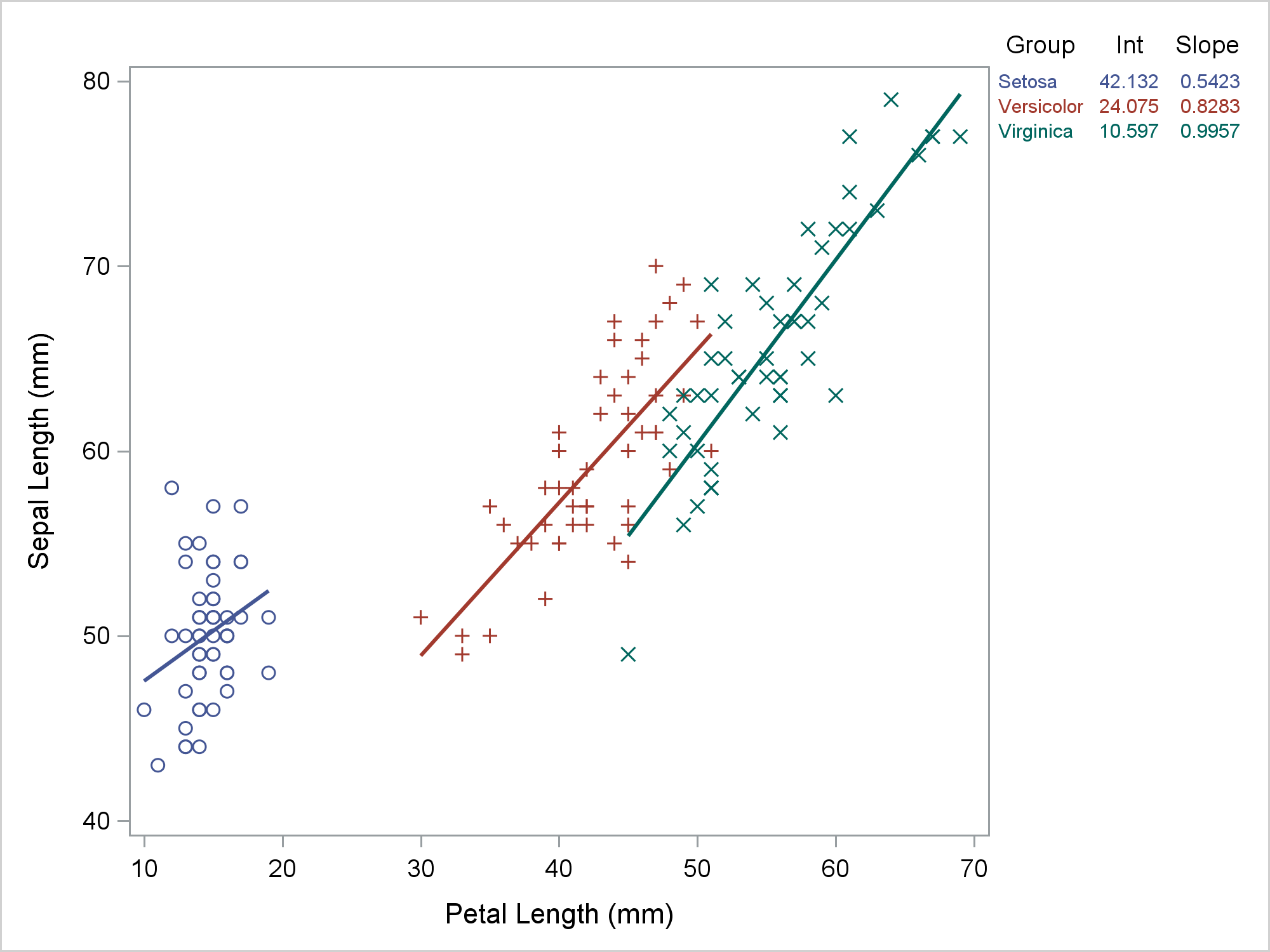
The table in the top right provides regression coefficients, but it also provides a legend for the graph. Setosa is the blue group, Versicolor is the red group, and Virginica is the green group. The visible part of the graph consists of a regression fit plot that is produced by the REG statement and a table of parameter estimates that is produced by the YAXISTABLE statement. The invisible part is the scatter plot that provides coordinates for the rows of the axis table. The input data set has three parts. It was created by merging the data set that contained the data for the regression and the data that contained the parameter estimates for the axis table while adding the row coordinates. An attribute map ensures that the two parts of the graph use consistent colors. That was my final program not my starting point. My starting point looked more like this.
proc sgplot data=all; styleattrs datalinepatterns=(solid); reg y=sepallength x=petallength / group=species; scatter y=row x=petallength / y2axis markerattrs=(size=0); yaxistable group Int Slope / y=row y2axis colorgroup=group; y2axis reverse display=none; run; |
Hmmmm .... that's not right. Versicolor is red in the graph and green in the table. Virginica is green in the graph and red in the table. So what went wrong? Technically, nothing. PROC SGPLOT is working as advertised. The problem was my expectations. So where did I go wrong? Let's begin by looking at the input data set. The following step displays the first five observations out of 150.
proc print data=all(obs=5); run; |
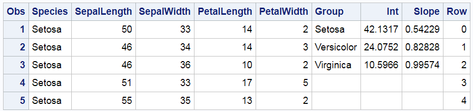
The Species variable, which is the group variable in the REG statement, begins with Setosa. While the other values are not shown, they do in fact appear in alphabetical order: Setosa, Versicolor, and then Virginica. This is the same order as the Group variable, which is specified in the COLORGROUP= option in the YAXISTABLE statement. ODS Graphics assigns the style element GraphData1 to the first group, GraphData2 to the second group, and GraphData3 to the third group. Since the values are in the same order in both variables, shouldn't they match in the graph? Well, maybe; maybe not. I will show you how to figure out what is really happening here. There are important lessons here that can help you in other situations where PROC SGPLOT is behaving perfectly rationally but not in the way you might expect.
Both of these next two statements are correct:
PROC SGPLOT provides an interface to the graph template language. PROC SGPLOT has a much simpler syntax than the GTL. You can build graphs that have many components. Sometimes those components interact with each other, and that is what is happening in this example. This next step can help you understand what is happening.
proc sgplot data=all tmplout='tmpl'; ods output sgplot=dataobject; styleattrs datalinepatterns=(solid); reg y=sepallength x=petallength / group=species; scatter y=row x=petallength / y2axis markerattrs=(size=0); yaxistable group Int Slope / y=row y2axis colorgroup=group; y2axis reverse display=none; run; options missing='.'; |
It has one new option and one new statement. The TMPLOUT= option writes the graph template to a file. The ODS OUTPUT statement outputs the data object to a SAS data set. Let's begin by looking at the graph template.
proc template;
define statgraph sgplot;
begingraph / collation=binary subpixel=on dataLinePatterns=( 1 );
DiscreteAttrVar attrvar=__ATTRVAR1__ var=Species attrmap="__ATTRMAP__";
DiscreteAttrVar attrvar=__ATTRVAR1__ var=eval(sort(Species, RETAIN=ALL)) attrmap="__ATTRMAP__";
DiscreteAttrMap name="__ATTRMAP__" / autocycleattrs=1;
Value "Setosa";
Value "Versicolor";
Value "Virginica";
EndDiscreteAttrMap;
layout lattice / columnweights=preferred rowweights=preferred columndatarange=union rowdatarange=union columns=4;
   layout overlay / y2axisopts=( reverse=true display=none type=linear );
      ScatterPlot X=PetalLength Y=SepalLength / primary=true DataID=__TABLE__ group=__ATTRVAR1__;
      RegressionPlot X=PetalLength Y=SepalLength / NAME="REG" LegendLabel="Regression" Group=__ATTRVAR1__ Maxpoints=2;
      ScatterPlot X=PetalLength Y=Row / subpixel=off primary=true yaxis=y2 Markerattrs=( Size=0) LegendLabel="Row" NAME="SCATTER";
      DiscreteLegend "REG"/ title="Iris Species";
   endlayout;
    Layout Overlay /  y2axisopts=( reverse=true display=none type=linear ) walldisplay=none yaxisopts=(display=none griddisplay=off displaySecondary=none) y2axisopts=(display=none griddisplay=off displaySecondary=none);
    AxisTable Y=Row Value=Group / labelPosition=min yaxis=y2 colorGroup=Group Display=(Label);
 endlayout;
 Layout Overlay /  y2axisopts=( reverse=true display=none type=linear ) walldisplay=none yaxisopts=(display=none griddisplay=off displaySecondary=none) y2axisopts=(display=none griddisplay=off displaySecondary=none);
 AxisTable Y=Row Value=Int / labelPosition=min yaxis=y2 colorGroup=Group Display=(Label);
 endlayout;
 Layout Overlay /  y2axisopts=( reverse=true display=none type=linear ) walldisplay=none yaxisopts=(display=none griddisplay=off displaySecondary=none) y2axisopts=(display=none griddisplay=off displaySecondary=none);
 AxisTable Y=Row Value=Slope / labelPosition=min yaxis=y2 colorGroup=Group Display=(Label);
 endlayout;
endlayout;
endgraph;
end;
run; |
You do not need to be able to write code like this to be able to read it and find how the pieces interconnect. In particular, notice this statement:
DiscreteAttrVar attrvar=__ATTRVAR1__ var=eval(sort(Species, RETAIN=ALL)) attrmap="__ATTRMAP__"; |
The SORT function with the RETAIN=ALL option sorts the entire data set by the variable Species. That is, it sorts all rows by that variable. It does not just sort that variable. The SORT function appears in the template because the GROUP=SPECIES option is specified in the REG statement. PROC SGPLOT sorts the data and fits a separate regression function for each group. You can also see that PROC SGPLOT has read the sorted data to determine group membership. The three values of the Species variable appear in the template attribute map. Further notice that the attribute map variable __ATTRVAR1__ appears in the SCATTERPLOT and REGRESSIONPLOT statements but not in the AXISTABLE statements. If you print the subset of the data object that contains the axis table, you can see that the order of the observations has changed.
proc print data=dataobject; where group ne ' '; run; |

Now, Virginica comes before Versicolor in the Group variable. This accounts for the discrepancy. Earlier I asked: "So where did I go wrong?" I was wrong to think that knowing the order of the observations in the data set guaranteed that I knew the order of the observations in the data object. The fix is to use discrete attribute maps and specify the same attribute map in both the REG and YAXISTABLE statements as I did in my previous post. With discrete attribute maps, the mapping between species and style elements is explicit in both statements, and the fit plot and the axis tables match. If you do not look at both the template and the data object, it is hard to know what happened. This also points out that you do not want to suppress parts of the graph (such as the legend or the ticks on the Y2 axis) until you are sure that everything else is correct.
Notice too that PROC SGPLOT adds additional variables to the data object that were not in the input data set. These variables have nonmissing values in other observations. PROC SGPLOT creates new variables whenever it needs to do calculations before plotting. Statements that do computations include REG, PBSPLINE, LOESS, HBOX, VBOX, HEATMAP, and others.
The input data set had three parts: data for the REG, YAXISTABLE, and SCATTER statements. Arraying data like this--multiple parts next to each other with no correspondence between the rows--is perfectly normal. We do it all the time when we make sophisticated graphs. However, we cannot assume that the data set stays the way that we created it. Often it does, but not always.
In summary, PROC SGPLOT looks at the PROC statements, it looks at the data, and it writes a template that might depend on the data. That template might create a data object that is different from the input data set. When the final graph is made, the data object provides the values to plot, not the original data set. If you want to understand what is happening, you need to look at the PROC SGPLOT code, the graph template, the data object, and the final graph.